| Author: | Bartosz Telenczuk |
|---|---|
| Date: | August 24th, 2012 |
| Revision: | 1 |
Note
In all of the code examples are given in python 2.7 syntax. In addition, standard python imports are used:
import numpy as np
import matplotlib.pyplot as plt
from mayavi import mlab
List of exercises:
- Basic matplotlib -- first steps in matplotlib
- Exploring Olympic Games -- for more advanced matplotlib users
- 3D visualization with MayaVi -- 3D visualization in Python
This tutorial covers the basic pyplot interface of matplotlib. You will use the interface to produce quickly efficient visualizations of your data. You may skip the section if you used matplotlib before.
Generate two data arrays of equal lengths (X and Y variable). This could look like this:
import numpy as np
t = np.arange(0.1, 9.2, 0.15)
#add some noise to dependent variable
y = t+np.random.rand(len(t))
Import matplotlib.pyplot and plot the data as an XY graph:
import matplotlib.pyplot as plt
plt.plot(t,y)
plt.show()
Last plot appeared only after plt.show() command. To switch to interactive mode, in which you can see immediately the output of your commands use plt.ion(). Try calling the plt.plot function again.
Label the axes by calling plt.xlabel and plt.ylabel functions.
You can select line and point style passing a third format argument to plt.plot function. For example, to plot only points:
plt.plot(t,y,'.')
Find out from the plt.plot docstring about other formats. Plot the data with red stars and dashed line.
Export the plot to a PDF, PNG or SVG file using the plt.savefig function.
File olympics_merged.csv contains medal tables of the Summer Olympics from years 1920-2012 for each participating country. Your is to compare how different countries performed, find potential trends, outliers and factors correlating with the results.
You do not have to finish all exercises - please go in you own pace. However, if you are stuck, please ask tutors for help or check the solution from the school's website.
Importing data (10 min).
The data are stored in comma seperated value (CSV) format. Rows are different countries and columns are medal standings in consecutive years (for example 'gold_2012' gives the number of gold medals won by the country in 2012, 'silver_2012' is the number of gold medals etc.).
To read the file you may use the recfromcsv function of numpy:
data = np.recfromcsv('olympics.csv')
which returns a NumPy record array.
Inspect the data.
You may notice that there are lots of missing values (NaNs), which means that some countries did not participate in the olympics in some years. You can use the np.isnan to test if a value is NaN and remove it. This does the trick:
x = x[~np.isnan(x)]
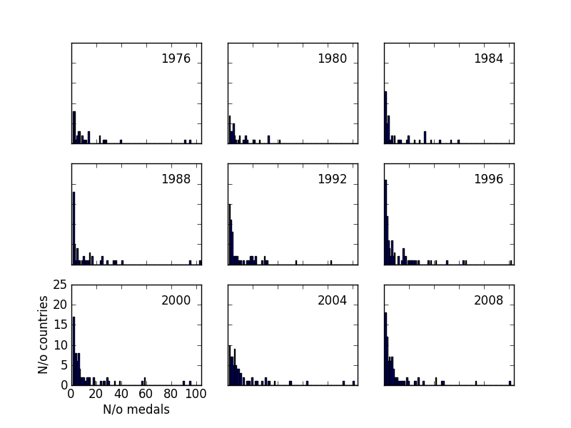
Medal distribution (15 min).
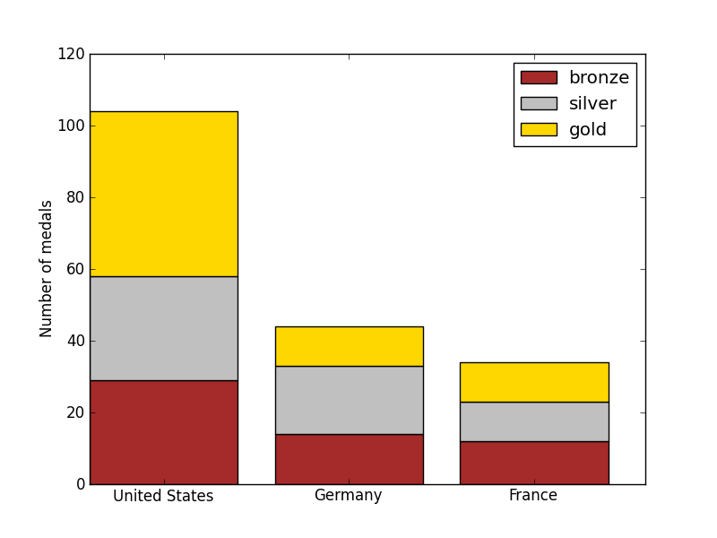
Country comparison (15 min).
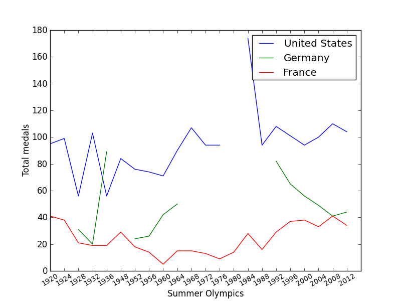
Time trends (15 min).
Do countries get better or worse in time?
Finding relationships (30 min).
It comes by no surprise that bigger and richer countries get more medals. Now you are going to analyse the relationship.
File country_aligned.csv contains some basic statistics about the countries. Open this file using np.recfromcsv function. Inspect the data. What new columns can you find?
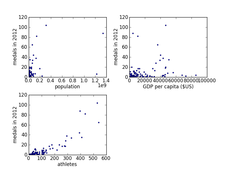
Plot number of medals won by each country as a function of its population, GDP and number of participating athletes in seperate subplots (use plt.plot or plt.scatter function). Do you see any correlations? (Figure 5a)
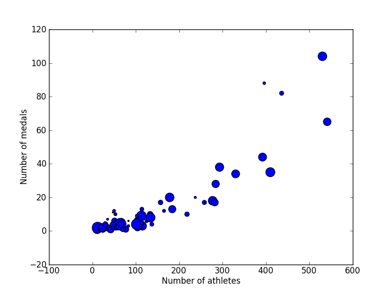
Add third dimension to one of the plots using size of the marker (use the third argument of plt.scatter function). You will need to scale the data to make the markers of appropriate size (Figure 5b).
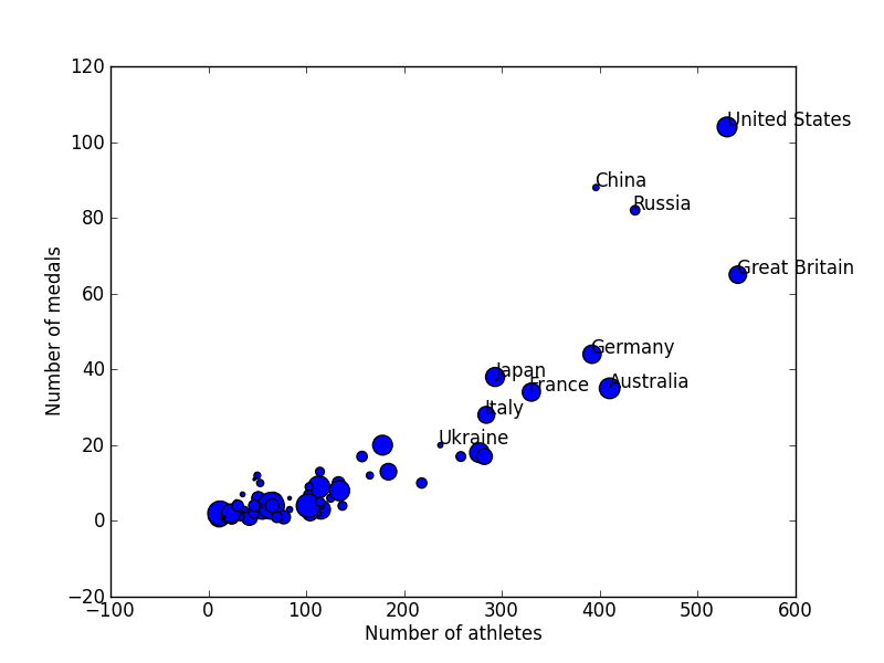
So far it is hard to associate data points with countries. Add labels using the plt.text or plt.annotate command to top 10 countries (Hint: remove NaNs before sorting!). An example:
plt.annotate(l, xy = (x, y))
l is a string with label, x, y are coordinates. You have to call this function once for each label. For more arguments, see docstring (Figure 5c).
(Advanced) Alternatively, you can add interactive labels on mouse click using the DataCursor class in data_cursor.py file. In order to activate it, you will have to instantiate the DataCursor class with the artist returned by plt.plot or plt.scatter, country names and string template (following Python 3 format). Remember to remove NaNs. See an example in data_cursor.py file or look it up in the solution.
Congratulations, you have just learnt the basics of matplotlib and you are ready to create your own data visualizations. I hope you enjoyed the exercise.
Data Sources:
Additional resources:
http://matplotlib.sourceforge.net/users/pyplot_tutorial.html
MayaVi2 is a state-of-the-art 3D visualization system in Python based on VTK library. In the following exercises, you will learn how to use MayaVi's mlab interface that integrates nicely with numpy.
To solve the exercises, run ipython with the following command:
ipython --gui=wx
All exercises require mlab interface, which you import using:
from mayavi import mlab
or:
from enthought.mayavi import mlab
Plotting 2D functions (15 min)
Although 2D functions can be often plotted on a plane using contours or denisty maps, sometimes it is better to plot it in 3D.
Generate a two-dimensional mesh of points on the domain x=[-3,3] and y=[-3,3]. You may use np.mgrid (see docs) object. For example:
XX, YY = np.mgrid[-3:3:5j, -3:3:10j]
will return 2D XX and YY arrays of size (5,10).
Implement a new saddle function defined by the formula \(f(x,y)=x^2-y^2\). Evaluate the function on the mesh from previous point (use vectorized operations!).
Use mlab.surf to plot the data:
mlab.surf(XX, YY, ZZ)
Adapt data range and mesh density for best visualization.
The leftmost icon in the toolbar of plot window opens the MayaVi interface. Use the interface to change the properties of the visualization (plot limits, colors, legends, etc.)
Flow fields: Lorenz attractor (30 min)
This exercise was adpated from a demo by Prabhu Ramachandran (http://goo.gl/Mc0Ea)
3D flow fields appear often in dynamical problems described by differential equations. Here, you will visualize three-dimensional Lorenz system and its beautiful attractor.
Lorenz system is defined by the following differential equations:
\[\frac{dx}{dt}=10(y-x) \] \[\frac{dy}{dt}=28x-y-xz \] \[\frac{dz}{dt}=xy-8z/3 \]Define function retruning the rhs of the equation. Use the following signature:
def lorenz(x,y,z):
    ...
    return dxdt, dydt, dzdt
Generate a 3D mesh on the data range x=-50..50, y=-50..50, z=-10..60. Evaluate the derivatives on the mesh (using the previously-defined lorenz function)
Using mlab.quiver3d function plot the vector field. The function takes 6 variables as arguments: 3 coordinates and 3 vector directions (the computed derivatives). You can adjust the size and number of vectors using scale_factor and mask_points keyword arguments, respectively.
Draw a sample trajectory from initial conditions of your choice. To do this, you have to integrate the Lorenz system numerically using odeint function from scipy.integrate. The first argument is a function of two arguments which returns derivatives. You will need a wrapper to use your lorenz function:
lorenz_ode = lambda r, t: lorenz(*r)
(there is no time in the rhs of above equation, so we can discard t). The other arguments of odeint are the initial conditons (in a tuple) and integration time (1d array):
from scipy.integrate import odeint
t = np.arange(0, 50, dt)
trajectory = odeint(lorenz, ics, t)
To ensure stability of the solution use small time step dt < 0.1. The trajectory is an array of size (len(t), 3). Each column stands for a different spatial coordinate (x,y or z).
To plot the result use mlab.plot3d function, which takes 3 spatial coordinates of the trajectory. For nicer visualization, pass time array t as its 4th argument and add a keyword argument tube_radius=None. Experiment with different initial conditions.
MayaVi offers the function mlab.flow which allows users to set the initial conditions via graphical interface and integrates the trajectory from the selected point automatically. Try to reproduce the previous step using mlab.flow function. Interact with the graphical widget and see what happens for different initial conditions. Can you see a similar structure appearing each time (attractor)?
Visualizing volumetric data (30 min).
Volumetric data assign a value to each point in the three-dimensional space. This type od data quite often appears in physical problems (electrostatic potential or 3D wavefunction), but also biological data (MRI scans, CT). In the example, you will visualize electrostatic field generated by a set of charges at fixed positions.
Define a 2D array of charge positions of size (N, 3) and 1D array of their charges (can be positive and negative) of length N. Plot the positions of the charges in the space using mlab.point3d function.
Calculate the electric potential generated by the charges at any point in space (x,y,z) by summing contribution of each charge (equal to its charge divided by distance from the charge):
\[V(x,y,z)=\sum_{i=1}^N q_i/\sqrt{(x-x_i)^2+(y-y_i)^2+(z-z_i)^2} \](we dropped a constant in the equation but it is irrelevant for this exercise).
Generate a 3D mesh and calculate the potential on this mesh. Plot the potential using mlab.contour3d function, which shows surfaces of a constant potential (isosurface).
Unfortunately you can only see one contour surface, because it occludes other surfaces below it. You can "open" some of the surfaces by clipping the potential. To this end, you will have to processing pipeline by hand (MayaVi similarly to VTK is based on pipelines in which visualization is divided into a sequence of modules receive, process and send the data. mlab interface simplifies this process by defining standard pipelines. However, for better flexibility sometimes you have to go to the internals):
source = mlab.pipeline.scalar_field(XX, YY, ZZ, V)
clip = mlab.pipeline.data_set_clipper(source)
mlab.pipeline.iso_surface(clip)
This will create a pipeline consisting of 3 modules (ScalarField data source, DataSetClipper filter and IsoSurface visualization). You can see the pipeline, when you open the MayaVi interface. The DataSetClipper creates also a graphical widget with which you can choose the clipping range with your mouse.